In Aploris bar, line and area charts share a common data sheet layout. For this reason the chart type can be changed after data has been inserted. Actually, this even extends to the Marimekko and waterfall chart (see Marimekko and “bar-mekko” chart and Waterfall chart for more information). Use the drop-down menu Chart type from the main toolbar to switch the chart type if required.
Each line in the data sheet – except the first which carries the header data – corresponds to a data series in the chart. The second column and each following represent data groups. As mentioned in section Data sheet rows and column with a blank first cell are excluded from the chart.
To select which data series and groups shall be displayed in the chart use the command Configure series/groups from the chart’s context menu.
In a bar or line chart a number of different data series can be combined. The context menu of a series or an element of the series can be used to switch between the series types.
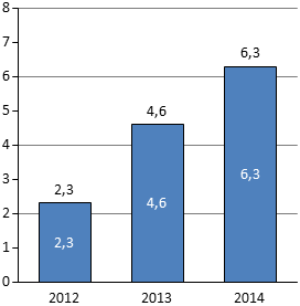
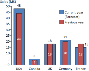
 Bar series: “Classic” bar chart series with rectangular bar elements. If more than one series is used in the chart elements are either stacked on top of each other or clustered side by side. Select
  Stacked bars or
  Clustered bars in the series’s context menu to switch between both options. For more sophisticated stacking options refer to Stacking editor.
  Line series: Default series type in a line chart showing a multi-segment line connecting the data points of the series. This series type can also be used to display marker symbols at the data points. By default a line series connects data points using straight lines. Select Smooth line from its context menu to remove corners in the series and display a curve instead.
  Net line series: Net lines are lines running parallel to the baseline of the chart at a specific value level. They can be used for instance to indicate the value of a previous period without dragging the focus from the current period’s values.
  Error bar series: Error bars are floating bar elements in the chart area. In contrast to the previous series their position is based on two data series from the data sheet, one supplying the lower value and the other identifying the higher value. They can be used to display a range especially for projected values that cannot be specified with an exact value. When creating an error bar series select two series before applying the series type change or select the second from the dialog that Aploris displays.
  Error indicator series: Error indicators are similar to error bars regarding the underlying data. Their appearance consists of a line instead of a filled rectangle. Error indicators are useful to indicate a tolerance range around a value determined by another series.
As usual, the object toolbar can be used to configure the appearance of the series or individual elements. Use the range selection feature (see Object selection) to adjust the style of a number of contiguous elements.
The commands Fill, Lines and Markers from the main toolbar can be used to apply a predefined scheme to all series and elements in the chart.
Visual styles of axes and tick marks can be edited as well. Additionally, a frame can be added to the chart area using its object toolbar.
To change the width of bars in the chart use the Bar width submenu from an element’s context menu or enter a custom value for Gap in the axis property dialog (see Axis options). Alternatively, use the stacking editor for more customization options (see Stacking editor).
For line series you can configure the appearance of the line as well as the markers at each data point. Note that for very dense lines it may be hard to select the line when it is overlayed by many markers. In this case you can try to zoom in to select the line. If this is not possible you can configure the legend symbol which automatically updates the line (add legend before if required).
To rotate the chart by 90∘ use the  Rotate left/
 Rotate right commands from the chart’s context menu. This way a bar chart displaying vertical columns can easily be turned to a horizontal bar chart. Rotating the chart is also possible for charts using other series types like line series or error indicators.
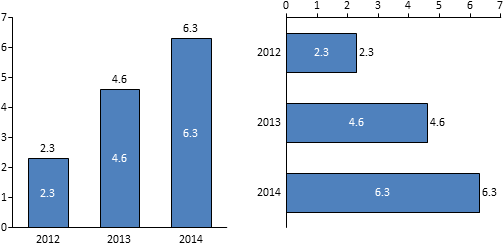
If you want to flip the chart layout like turning a bar chart with vertical columns upside down you can also drag the category axis to its opposite position (instead of rotating the chart twice by 90∘).
Axes are important objects to define the layout of a bar or line chart. A chart uses at least a category axis carrying the group descriptions and a value axis that determines the position of data points in the chart. To toggle the visibility of the value axis use the chart’s context menu.
To change the range an axis displays bring up the axis properties dialog. By default the axis range as well as the distance between two tick marks is determined automatically by analyzing the associated data. To manually override any of the default values uncheck auto and enter a custom value into the corresponding text box.
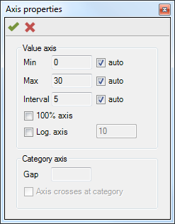
Note: If the chart data obtained from the data sheet is outside the manually defined axis range, the outlying values will be placed at the higher or lower end of the axis which may distort the proportions of the chart data.
The same dialog is used to configure an axis as 100% axis. The command  100% axis is also available from the axis or chart context menu. Using this feature leads to a representation where the sum of the bar series in each group is used as 100% and the bar elements are distributed along the value axis accordingly. Other series are also scaled to the 100% scale in each group. Again, outlying values are placed at the outer ends of the axis like in the case where bar elements sum up to 10 but a line series data point carries a value of 15.
Using the axis properties dialog or the command  Log. axis from its context menu an axis can be configured to scale value logarithmically. For a logarithmic axis the ratio between the values of two consecutive tick marks is constant as opposed to the difference for a regular axis. By default the ratio is 10 so the axis may display the tick mark values 1, 10, 100 and 1,000. A base value different from 10 can be entered into axis properties dialog.
Note: When using a logarithmic axis the displayed height of a value depends on its start position on the axis. Therefore usually all values should be displayed relative to the chart’s baseline like in a clustered bar chart. However, Aploris allows to configure a logarithmic axis for stacked bars as well should this be required for special reasons.
A second value axis can be added which allows displaying data with different dimensions. For instance you may want to display revenue per company division in million dollars as well as employee headcount. In this case use  Second value axis from the chart’s context menu to display the second axis and use the same command from the series or element menu to move the headcount series to the new axis. (The second axis must be created before this command is available.)
More customization of an axis scale is possible using axis breaks. These axis breaks collapse an interval in the range of an axis thereby making small differences visible that would otherwise be hard to notice due to large values in the chart.
 →
→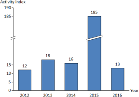
Insert an axis break by pointing at the value axis at the desired level and then selecting  Axis break from the context menu. Once the axis break has been inserted its context menu allows you to change the appearance using
  Wiggly line and
  Straight line.
Axis breaks are managed automatically by Aploris. This means that an axis break will be deleted when it lies outside the axis range due to a change of the chart data. The same happens when Aploris determines that not enough space is available for an axis break, i.e. the visual appearance of the axis break requires more space than the interval that it is supposed to collapse would require on the value axis. In general, due to its fixed height a wiggly line axis break needs less space than a straight line.
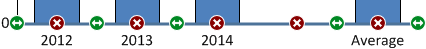
A distinct feature of the category axis is its ability to insert empty groups to visually separate data groups. To use this feature simply select the category axis. Use the button  Insert group to insert an empty group between two other groups. The button
  Remove group can be used to delete an empty group from the chart or to hide a data group.
For category axes an additional parameter Axis crosses at category is available from the axis property dialog shown above. Selecting this options makes the first data group begin at the value axis which is possible only for line charts.
 ↔
↔
To change the positon of an axis in the chart it can also be dragged to its opposite position. When two value axes are displayed their positions will be flipped.
In this dialog group you can also enter a custom value into the text box Gap which determines the bar width. The value Gap determines the gap between two neighboring groups in the chart relative to the width of a bar. This means that the bar width value that can be configured in the bar element’s context menu is the inverse value of gap value declared here (e.g. bar width = 125% ⇔ gap = 0.8).
For each tick mark of an axis a grid line can be displayed. To display grid lines for an axis select Show grid lines from its context menu. They can be removed and formatted individually as described in Editing objects – object toolbar.
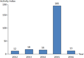
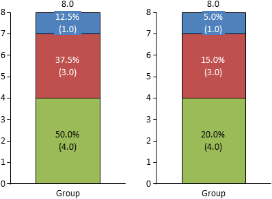
When an element’s label content is defined as “%” usually Aploris will use the group sum as base for calculating the percentage value. So a group with three values 1, 3 and 4 (Sum 8) would display 12.5%, 37.5% and 50.0% which sum up to 100%.
In some cases you may wish to use a different base for the percentage calculations. To achieve this select Custom 100% from the chart’s context menu. The second line in the data sheet will now solely be used to calculate the percentage values and will not be displayed in the chart anymore. Choosing Custom 100% will return to regular behavior.
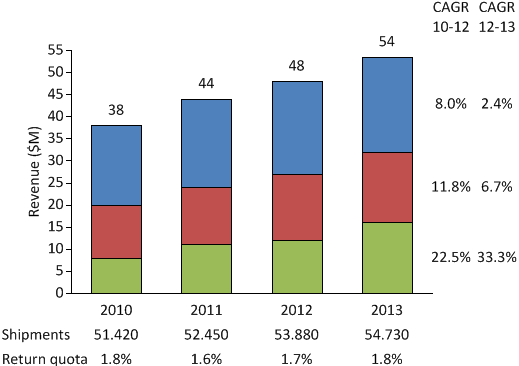
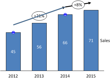
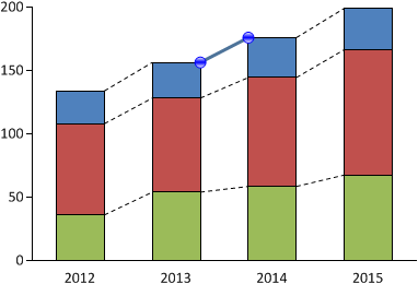
For certain scenarios you may want to add data to the chart that refers to series and/or groups but is not suitable for inclusion in the visual chart. Aploris offers annotation series and groups for this purpose. See the following chart for a typical example that includes growth data for each series as well as additional information for each business year.
To add annotation data to a chart select Configure series/groups from the chart context menu to open the series/groups configuration dialog. For each series and group you can select whether to display it in the visual chart and/or in the annotation data.
After adding data to the annotation series or groups it will be displayed in a tabular format next to the chart. The position of each element is aligned with the group it belongs to or the last element of the corresponding series. You can move and resize the table, e.g. when elements overlap because not enough space is available.
You can also change the order in which the data is listed without altering the data sheet. Just grab the description of the annotation series or group and drag it to an alternative position indicated by a default drop position.
Of course, if the data contains numerical values you can change the label content regarding magnitude and number format as described in chapter Labels. Non-numeric data is rendered as read from the data sheet.
Aploris’s stacking editor is a unique feature that enables you to design sophisticated charts like a combination of stacked and clustered bars or overlapping bars.
The stacking editor can be started from the context menu of the chart. In its simpler form shown below you have the opportunity to change the position of chart elements in a group and to set the width of a bar within a group. On the right side of the dialog window you see a simplified depiction of a single group in the chart with one element of each series. By dragging any element you can assign a new position within the group. This way new bars can be created and the stacking order or the order of bars can be changed.
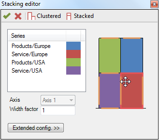
Additionally, after selecting an element from the list or in the interactive editor you can change the axis reference and the width factor. The width factor determines the relative width of bars in a group. For instance if two bars have been configured and you assign width factors 2 and 3, the first bar will use 40% (= 2/5) and the second bar 60% of the width of the entire group. The width of the entire group is determined by the bar width/gap of the category axis. The values entered for the axis reference or width factor are applied to all elements in the same stacked bar.
Note: Due to the simplified nature of the stacking editor’s visualization all bar elements are displayed in the same size and the orientation assumes that the category axis is at the bottom of the chart. When confirming the changes made in the stacking editor they will be applied to the chart. The resulting groups in the chart will usually look different than the simplified stacking editor’s visualization.
For even more flexibility the stacking editor offers an extended configuration which can be shown by selecting Extended config. in the stacking editor. You now have the option to configure the position of each element within a group and its width if applicable. Move the sliders and the interactive editor will show you a preview of the resulting changes. Elements in a group may now overlap so it may be required to adjust the z-order positions of elements using the context menu commands Move to front/Move to back in the interactive editor.
As the stacking order may be ambiguous after the extended configuration has been defined, dragging elements in the interactive editor will not be possible. It is therefore required to set up the stacking order of elements before using the extended configuration. Should changes to the stacking order be required after the extended configuration has been defined you need to use Reset to discard the extended configuration.
Although chart elements can be labelled with the name of the series the chart may be clearer if it carries a distinct legend. Aploris allows adding a legend to a chart by selecting  Show legend from the chart’s context menu. By default all series that are shown in the chart are added to the legend in the order in which they are listed in the data sheet.
In order to delete an item from the legend simply remove its label. It can be added back to the legend from the series’s context menu.
To change the order of the legend items drag any label to an alternative predefined position. Make sure to only select a single label as reordering is only supported for individual legend items.
By default all legend items are displayed in a single column stacked on top of each other. To change this layout bring up the context menu of the legend and open the Alignment submenu. Select Two columns for two columns, Legend row to put all items in a horizontal row or choose Custom to configure any number of columns. You can also enlarge the width or height of the legend area to create space for additional columns or rows. Aploris will then re-evaluate the number of columns to display.
The legend symbol can be formatted regarding line, fill and marker style as applicable. Changing the legend symbol will automatically update all corresponding elements in the chart. This can be used to adjust elements that are otherwise hard to access in a dense chart.
Aploris supports a number of elements that can be added to the chart to put a focus on certain details.
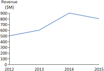
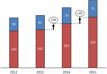
A growth arrow connects the sums of two stacked bars or data points for other series types. Select  Growth arrow from the chart, series or element context menu to add a growth arrow to the chart. By first selecting two elements or data points you can tell Aploris where to place the growth arrow.
If the growth arrow is not connected to the right elements select the growth arrow to show its current connecting points (blue shaded circle). Drag the connecting anchor to another position to adjust the placement of the growth arrow.
To change the direction of the growth arrow select Change direction from its context menu or double-click on the growth arrow. If you would like to adjust the vertical position of the growth arrow drag the growth arrow to the desired position. (This assumes that the category axis is at the bottom or top of the chart, otherwise the horizontal position can be adjusted in the same way.)
The label of the growth arrow can be configured to display the absolute difference between the two connecting points, the relative difference or the compound annual growth rate (CAGR). The relative difference is calculated based on the value at the origin of the growth arrow. The CAGR value takes into account the values at origin and target of the growth arrow as well as the difference between the connecting data groups. As usual, arbitrary text can be added to the growth arrow label.
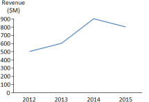
A delta bridge spans the distance between the sums of stacked bars or data points. Inserting and modifying a delta bridge is very similar to a growth arrow.
In contrast to a growth arrow which is directed by definition, a delta bridge can show arrows on both sides. However, determining the absolute or relative difference still differentiates between origin and target of the delta bridge. For this reason the direction can be changed even for a delta bridge displaying both arrows.
Delta bars are comparable to delta bridges but can be used to indicate the difference between two elements even when they are included in a stacked bar.
The usage of a delta bar is the same as for a delta bridge.
Value lines can be used to indicate a value level in the chart and run parallel to the category axis. A value line can be inserted with the command  Value line from the axis context menu. The first value line is automatically placed at the mean value of the chart data. If a value line is snapped to the average value its position is automatically updated when the chart data changes.
The position of the value line can be adjusted by dragging the value line. It snaps to positions determined by the scale of the corresponding axis. To position the value line exactly press the Alt key to disable snapping.
Element connectors can be added for the entire chart or for individual elements only. Use  Add connectors from the chart’s context menu to insert connectors for all bar series in the chart. Additional connectors for new bars are automatically inserted until a custom adjustment to a connector is made.
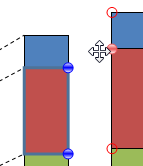
To adjust a connector select it to display its anchors as shown in the picture. Drag any of the two anchors to a new position or press Del to remove the connector from the chart.
If you want to insert custom connectors into the chart, click on  Connector insertion in the main toolbar. This toggles the connector insertion mode. When turned on, chart elements display a set of handles (blue shaded circles) in the corners where no connector is attached yet. Grab any of the handles and drag to a potential target position to create a new connector.