A Gantt chart or project plan is used to display a number of tasks on a timeline like a sequence of work items within a project. In contrast to other charts a Gantt chart does not require Excel data but can be filled interactively using the mouse.
The chart usually contains multiple rows of tasks. In each row one or more items can be displayed. Items can have a duration which means they cover a range on the timeline like a process. Or they only highlight a single date usually a milestone.
A new Gantt chart is initialized with a default period, rows and formats. Please refer to the following sections to learn how adjust the chart to your needs.
After inserting a new chart you will see a number of empty rows with default labels. Edit the name of the task by editing the label. If additional columns for responsibility and notes are displayed the corresponding labels can be edited as well.
The row context menu can be used to delete a rows including all its items or to add new rows.
To change the order of rows simply pick one or more rows and drag them to a new position. This is possible only if the mouse cursor is in the columns Task, Responsible or Notes since the timeline is used to add and edit items interactively.
Timeline items are either periods or events/milestones. Periods can be displayed in different styles which are used for certain purposes.
| Bar |  |
Typically used to display a task/process with a certain duration |
| Chevron |  |
Used for a task/process with a certain duration as alternative to a bar |
| Bracket |  |
Used to describe a date range, often subsumes multiple tasks/processes |
To insert a new period click on a point on the timeline of a certain row. The new period will be added for this row and start at the point you have clicked on. Now drag the mouse to specify the end of the period and release the mouse button. A tooltip will indicate the currently selected date range while dragging the mouse. If the width of a single day is small, the mouse will snap to entire weeks. You can override this behavior by pressing the Alt key. After releasing the mouse button you can select which type of period to insert.
If you need to insert an event/milestone simply select the appropriate row and click at the position where the event shall be inserted.
To delete an item select it and press Del or select  Remove from its context menu. As in other charts Shift and Ctrl can be used to select multiple items.
In order to change the position of an item you have multiple options.


This method can be used to move several items at the same time. Note that you can create copies by holding down Ctrl while dragging.
 Select period from its context menu. An interactive calendar allows you to change the date range of a period or to select the day for an event/milestone. For a period you can drag the current start or end to a new value or select a new range, then confirm with Ok. For an event simply click on the new day.
To facilitate updating items that are dependent on other items these dependencies can be included in the Gantt chart. If you drag the handle of an item Aploris highlights all positions to which the item can be anchored. Anchoring means that the value for the start or end of an item will be taken from another item. If the target item changes its position the dependent item will be updated as well.

It is possible to visualize the dependencies that were created by anchoring items to each other. Select  Anchor lines from an item context menu to display an arrow connecting the dependent items. You can change the direction and appearance of the arrow using its context menu and the object toolbar.

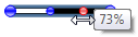
For bar periods Aploris allows you to highlight the degree of completion that is associated with a certain item. To make use of this advanced functionality select Progress from a bar context menu. Now an additional handle will be displayed if the bar is selected. Drag this handle to a position in the bar between 0% and 100%. By default positions snap to 10% intervals, use Alt to use 1% intervals if required.
Events/milestones can be displayed in two styles. Select  Change to diamond and
  Change to triangle from a milestone context menu to toggle between the shapes. The color can be selected using the object toolbar. A vertical line can be added to highlight the position of the milestone by checking
  Vertical line in the context menu.
By default a Gantt chart displays the timeline and one column to its left for task names. Two additional columns Responsible and Notes are supported on the right side of the timeline. Select Responsibility labels and/or Notes labels from the chart context menu to enable the additional columns. Once the columns are displayed additional labels are available for each row that can be edited as usual.
Note: Normally, the width of the entire chart remains unchanged when columns are added or removed which means other columns are redistributed. If you hold Ctrl while clicking the context menu item, the relevant column will be added/removed while other columns keep their widths.
If you need more space for a column you can use the vertical divider lines between columns to change the widths of timeline and columns. If you hold down Ctrl while dragging, only the width of a single column will change thereby adjusting the entire width of the chart. This also works if you drag the left or right side of the chart while holding down Ctrl .
The layout and the appearance of the timeline of a Gantt chart can be customized to suit individual requirements.
When the chart is created a default period will be visible. To change the period select Select period from the chart context menu. Use the calendar control to select the date range to be displayed. To adjust only begin or end of the period drag the current begin or end date.
To optimize the visible period select Adjust period to data from the chart context menu which will make begin and end of the displayed period match the earliest and latest date used by any of the items in the chart. Note that the update is only made once and you can continue to edit timeline items without the period being updated as you make changes.
Additional settings can be made by selecting Configure timeline which will bring up the timeline properties dialog.
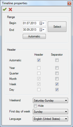
The displayed period can be configured as described above.
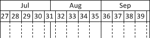
The second group allows selecting the headers and separators to display for the timeline. Both categories support automatic adjustment which means Aploris will determine automatically which header rows to display. You can choose to disable automatic update and configure the displayed headers manually. This may be any combination of year, quarter, month, week and day. The selection can also be made in the  Headers context submenu of the chart.
Likewise, separators can be configured which are vertical lines between consecutive years, quarters, months etc. These lines are displayed over all rows in the chart except the last if it is configured as a milestone row. Again, you can let Aploris determine automatically which separators to display depending on the visible period and the width of the timeline. The  Separators context submenu allows setting the values outside of the dialog.
Below the headers group in the timeline properties dialog you can configure which days of the week the Gantt chart will regard as weekend days. If you hide these weekend days they will not be displayed on the timeline and periods will end before a weekend if they do not stretch into the new week.
The definition of the first day of the week determines where week headers and separators will be placed. E.g. if the first day of the week is configured to Monday, a week separator line is drawn between Sunday and Monday and Sunday will assigned to the previous week relative to the following Monday.
Changing the language for a Gantt chart modifies the names that are used for month and day names and their abbreviations. The language is also used for localized captions in rows and column headers. However, since these values are usually edited by the user, changing the language does not modify these labels. They are only reset if a column is newly inserted (which may required removing it before).
PowerPoint’s current spell checking language is used for a newly inserted chart. The currently selected default language is displayed in the lower left corner of the PowerPoint window when no PowerPoint shape is selected. To change the setting select any shape, click on the currently selected language, select the desired language in the Language dialog and click on Default...
When a Gantt chart is created Aploris uses default design and format parameters to style the chart. You have a number of options to adjust the appearance of the chart to your requirements.
The chart is vertically divided in two parts, the upper displays the timeline header and column labels while the lower displays rows with tasks, items and descriptive labels. The divider line below the timeline header can be dragged to redistribute space between upper and lower part. Hold down Ctrl to change the height of the header only while maintaining the height of the lower part. The same applies if you move the top edge of the entire chart with Ctrl pressed or the bottom to change the height of the lower part only.
Column widths can also be adjusted as described in Edit columns.
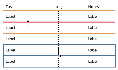
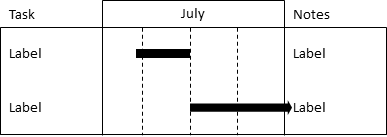
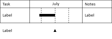
In some cases you may want to display a distinctive last row in Gantt chart that only shows major milestones. Select Milestone row from the chart context menu to make the last row appear outside the main chart area. This means it will not be included in the main frame and will not display separators. However, the row can still be used as any other row in the chart. The following image shows the difference between a milestone row being displayed or not.
If you prefer to have a rectangular frame around the entire header including column labels, simply check Frame headers in the chart context menu (see previous image).
Using the object toolbar you have the option to define background colors for rows and headers as well as change label settings as usual.
As in other charts labels are updated automatically when referring to a value in the chart. For Gantt chart this applies to labels in the timeline header as well as labels for items on the timeline. These labels typically display date values and you have the option to select the format from the object toolbar. Additionally, you can type in the desired format manually and choose from the following format identifiers.
|
Identifier |
Description |
Example |
|
yyyy |
4-digit year |
2014 |
|
yy |
2-digit year |
14 |
|
q |
Quarter as Arabic numeral |
3 |
|
|
Quarter as lower case Roman numeral |
iii |
|
qqq |
Quarter as upper case Roman numeral |
III |
|
M |
Month number |
8 |
|
MM |
2-digit month number |
08 |
|
MMM |
Abbreviated month name |
Aug |
|
MMMM |
Full month name |
August |
|
MMMMM |
First letter of month name |
A |
|
w |
Week number |
5 |
|
ww |
2-digit week number |
05 |
|
d |
Day of month |
7 |
|
dd |
2-digit day of month |
07 |
|
ddd |
Abbreviated day name |
Thu |
|
dddd |
Full day name |
Thursday |
|
ddddd |
First letter of day name |
T |
|
’week’ |
Text in single quotes is printed without |
week |
|
” |
Use two single quotes to display a single quote |
’ |