A spider chart (also known as web chart, star chart or radar chart) has a unique layout featuring several axes with a common origin. Each data series contains a set of characteristics, one data point for each axis. This means that each column in the data sheet translates to an axis in the chart. A minimum of three axes is required to display a meaningful chart.
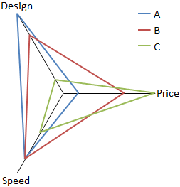
See the following picture for an example where three objects are compared regarding the criteria design, price and speed. You can easily recognize object B as very balanced across the criteria while A and C have clear strengths and weaknesses in certain dimensions.
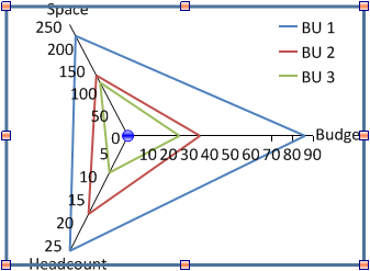
Of course, axes can also be used and labelled with quantitative data.
By default, all axes have the same length and the angles between two neighboring axes are identical so the chart will have the form of a symmetric star. You have the opportunity to rearrange the chart to your needs. To move the axis origin select the chart area to display a draggable handle. The end of each axis can be placed individually by selecting the axis and dragging the handle at its end. To reset the chart to its standard layout select Auto layout from the chart context menu.
Furthermore, the direction of each axis can be reversed using the command Reverse direction from the context menu if the data requires an inverse scale.
For a more appealing design you have the option of flipping axis tick marks and labels to the other side of the axis. Choose Flip tick marks to use this feature.
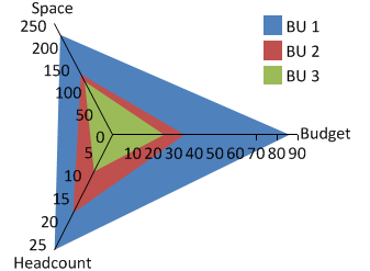
Objects in the chart can either be displayed as outlines or as filled polygons. Choose (regular) Spider or Polygon spider when inserting the chart. You still have the opportunity to switch the design later using  Outline chart and
  Filled chart from the chart context menu.
For a filled spider chart the z-order of the elements can be adjust using Send to front/Send to back.