A pie chart can be thought of as a 100% bar chart with only a single data group (bar). For this reason the data sheet only uses a single column for the chart data – apart from the first column carrying the descriptions. Additional data will be ignored.
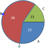
When a pie element is selected it shows two handles. Use the handle at the corner of the element (green shaded circle) to rotate the pie chart. The element will snap to positions when either of the sides or its center is located at an angle of 0∘, 45∘, 90∘ etc. The second handle (blue shaded circle) is used to drag the element away from the center of the pie thereby creating an exploded pie chart.
If you want to reverse the order in which elements are displayed use the command Counter-clockwise orientation from the chart’s context menu.
Custom 100% can be used to alter the percentage values in labels as described in Percent labeling/custom 100%
Additionally, a legend can be edited and configured as explained in section Legend.